27 November 2011

Final Magazine Evaluation

In which ways does your media product use and challenge the typical conventions of a magazine?
In order for  my magazine to be recognised as a indie rock music magazine by my target audience, I have ensure to follow particular conventions which apply to this genre of music magazines. However I have also ensure to challenge some of the typical indie rock music magazine conventions, in order to make my magazine unique and stand out from the many other magazines. To display which conventions I have used and which conventions I have challenged I have created three interactive presentations below on the website Prezi, for my front cover, contents page and double page spread.


--------------------------------------------------------------------
In which way does your media product represent a particular social group?
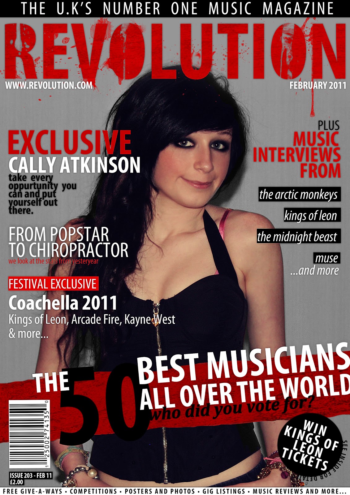
To display how I have represented a particular social group, I have compared the character represented within my magazine and a character represented in a mainstream magazine, in the form of singer Taylor Momsen. The individual displayed in the mainstream media magazine, represents the particular social group of indie rock teenagers. This social group, has become increasingly popular in the last few years, therefore I feel to appeal to my audience it would be best to portray this social group in my character. 

The body language is very similar in both images. The posture appears very relaxed and casual, however with the addition of placing both hands on the waist area, this adds a bit of a edge and attitude to the image. A medium shot is used in both images, with a central eye level angle. This is effective as attitude is brought throughout the eyes, which projects to the eye contact made between the image and the audience. The costume, hair and make-up, is very similar in both images. Featuring very dark and smouldering eye make-up to create dramatic eye contact, a very dark and grungy costume and a dishevelled and tousled hair style, all of which are used to project the indie rock grungy genre of the magazine. Both images also appear to be taken in a studio area, with a plain background, which allows the dramatic imagery to stand out more. However the lighting used within my image appears darker with more contrast then in the mainstream image of Taylor, which appears to be more faded and whitewashed, with less contrast. 

Much like artist featured in the mainstream magazine, Taylor Momsen, I would to promote the values and beliefs that girls can also be very talented musicians in the genre of indie rock, which is usually dominated by men. I would also like to promote the strong belief in that you can achieve anything if you try hard enough, much like the Taylor, who has become a musician at the very young age of 19. However in the media she is often criticised for being a bad influence on the genre of music my taking the 'edgyness' too far. Although I would like to still portray my character as a genuine typical teenager, I would also like my character to be a good role model to girls and display that girls do not necessarily need to swear and act too sexual to be successful.
--------------------------------------------------------------------
Which kind of media institution may distribute your media product and why?
To identify a media institution that would be likely to distribute my product, I first identified a product which was similar to mine, in the form of NME music magazine, which can be displayed below.
As NME magazine is of a similar style and genre to my magazine, I feel those who distribute this magazine would be likely to distribute my own music magazine. Therefore the distribution company I have chosen is IPC Media, as they would know exactly where and how would be best to distribute my magazine, in order to gain a high popularity readership and sales revenue.  IPC Media, is a magazine and digital publishing company in the UK, that is owned by Time Inc. and conglomerate of Time Warner
I feel this company will the best for my magazine as 'IPC Media produces over 60 iconic media brands' which range from sports, to home and garden, to music. Therefore my magazine will fit comfortably amongst a range wide range of magazine genres to benefit the interests of everyone. 
According to the IPC Media website 'Print alone reaching almost two thirds of UK women and 42% of UK men – almost 26 million UK adults – while our websites collectively reach over 20 million users every month’. Therefore I feel choosing this institution would allow my product to be in good hands and allow it to be distributed to my audience successfully. It could also increase purchases, through association with the 60 other magazine brands that IPC Media own, by advertisements, which could also bring in a wider audience.

--------------------------------------------------------------------
Who would you define as the target audience for your magazine?
To allow my magazine to attract and appeal to the target audience in which I will be marketing my magazine towards, I made sure to understand both their interests and their lifestyle in order to cater my magazine to be interesting and suitable for them. Before identifying my overall target audience, I produced a basic review and profile on a typical audience member, who enjoyed reading the genre of music magazine I had created, indie rock.
The specific audience member I had chosen was Nikki (displayed in the photo above), who is of 18 years of age and a full time student at college. In order to give me a basic understanding of the type of audience who would be likely to purchase and enjoy reading my magazine, I interviewed Nikki to find out more about her interests. She enjoyed socialising with friends and hanging out with them on a regular basis. She also enjoyed listening to a range of music specifically in the indie and rock genre and sub-genres and often attended gigs and concerts, which included both a range of high profile and independent local bands. She also had a large interest in fashion and shopping, particularly in clothing which was highly influenced by her favourite music genres indie and rock.
After gaining a basic understanding of the type of audience I will be aiming my magazine towards, I was able to determine by specific target audience (displayed in the image above), who I would define as those of both a male and female gender, between the ages of 16 to 25 and often are in college/university or have a part time job. To allow me to understand how I will appeal to my target though my magazine, I created a questionnaire on Google Docs, which can be displayed below.
Below are the answers given by a sample of my target audience members:
From the answers provided we can see that my target audience mainly enjoy listening to indie and rock music, with outside influences from r'n'b and pop too. They regularly enjoy going out with their friends and spend the majority of their money on clothing and concert/gig tickets. They are mainly of a working class background and attend college as students. They enjoy comedy films, and their favourite TV shoes mainly consist of programmes such as The Inbetweeners, Skins, Misfits and Family Guy. They also enjoy shopping at mainly high street clothing stores such as H&M, Top Man & Top Shop and River Island. 

To ensure I knew that I had appealed to my target audience successfully, I conducted a small discussion group, of which my audience discussed what attracted them to my magazine and if they would purchase it, of which I recorded on a hand held camera. This was attended to be posted as support of my audience feedback on my blog and in my evaluation, however unfortunatly there was many technical issues, in that the video would not upload onto my blog or any other social networking websites such as Facebook or you tube, in which I could have posted the link. Therefore I have placed my peer audience feedback on a disk which can be previewed along with the printed version of my magazine.

I also asked my audience to note down whether they would purchase my magazine and why, to identify if I needed to make any last minute changes. One of theses pieces of feedback can be displayed below.
--------------------------------------------------------------------
How did you ensure to attract and address your audience, through your magazine?
After producing my target audience research I had a better understanding of the lives and interests and what appeals them to a magazine. This allowed me to attract my audience in a number of ways, which can be displayed in the video below.
--------------------------------------------------------------------
What have you learnt about new technologies and software, from the process of constructing your magazine?
When designing and creating my music magazine, I have used various forms of technology and software to help me through the whole production process, each of which can be displayed in the collage below which I created on Picnik.
The pieces of hardware I used within my production process were a Digital SLR Camera and my laptop computer. My computer was very important in the production process, as it gave me access to all the software I needed to design, create and edit my magazine. It also gave me access to the internet, which allowed me to find and use many websites which I had never used before. These include Blogger to create my production blog, Deviant Art to gain feedback and Prezi to create interactive presentations.

To take the photographs for my magazine, I used a SLR camera in the form of the FUJIFILM Fine Pix S2750HD Digital Camera. I used this particular camera, as i wanted my photos to look as high quality as possible in order to ensure my magazine looked professional. This was the first time I had used a SLR camera, therefore I wasn’t very familiar on how to use it. To help me use the camera correctly I visited the two following two websites Facethelight and DSLtips. This allowed me to learn many techniques and tips, which allowed me to take high quality photographs for my magazine, which I am very pleased with. As I have purchased a SLR camera for my own personal use, this process also helped me to learn many techniques and tips which I could use when taking photographs within my own time.

To both edit my photographs and design my overall music magazine pages, I used the popular digital and editing software, Photoshop CS5. As I have previously used this piece of software before, I felt at ease with the using software and had knowledge of the many techniques I could use. However when it came to editing my photographs, I wanted to ensure the contrast was high and that appeared shadowy and grungy, something I had not done before. Therefore I learnt how to use a variety of layer and brush combinations and techniques.

To display each stage of my research, planning and production of my magazine, I have used the popular blog publishing website Blogger. This is the first time I have ever used this website or a web blogging platform overall, however I was very pleased with how helpful this website was, when creating my magazine. When I first began to use Blogger, I was a bit confused with how to create and publish each post to blog; however after visiting various help pages and tutorials, I quickly learnt how to use the site with ease. I am very happy that I chose to use Blogger when creating my magazine, as I felt it was much easier than if I were to use the file portfolio method. The website allowed me to have all my research in one place, which was much easier to find if I had amendments which I need to change. It also allowed me to document every part of my process, even those that were minimal, such as simply changing the font on my magazine page or finding a photo shoot image which I would like to replicate on my magazine. After learning the basics of simply creating posts, I then learnt how could insert evidence into each post in many forms including, photos, videos and audio. This was extremely helpful as it allowed me to display all parts of research, planning and production which contribute to my overall product, for example, photo shoot photographs and inspirations for my magazine and photo shoot. Therefore I can display which aspects of my production went well and which aspects went not so well and needed amendments, with evidence.

To gain feedback for my magazine I used a popular art sharing website called Deviant Art, which I had never used before. Although this was not my primary source for audience feedback, I used this website to display my product to audiences worldwide, to gain a small amount of feedback, which without these websites would require me to pay a producer or publisher to promote it.

Other website which were, Prezi, which allowed me to create interactive presentations when evaluating my final magazine product. Google Docs, which allowed me to create an interactive on-line questionnaire, to gain information about my target audience and feedback on my magazine. The last website I used was Swimchick, a tutorial blog, which provided me with the tutorials to create a grungy and dramatic effect on my magazine photographs.
--------------------------------------------------------------------
In which way do you feel you have progressed from the preliminary task up to your final product?
From my preliminary task, which I produced before beginning my music magazine as a college magazine, I feel I have progressed greatly in my understanding of creating and designing a magazine. This can be displayed in the slide shows below, which I created on the website Prezi, which show the progression through the use of image, fonts, colour, text and layout within both my preliminary task college magazine and my final product music magazine. 


How do you feel about your final product overall?
Overall I am very pleased with how my magazine has turned out. I feel I have created my magazine to a high professional standard, that would sell well in stores. I feel I have followed the conventions well, which will allow my magazine to be well recognised as a indie-rock magazine to my audience and amongst other magazine. Furthermore I also feel I have a good knowledge on my target audience and will be able to attract and appeal to them successfully, in order for them too purchase the magazine.
--------------------------------------------------------------------
What have you learned from this experience that might help you, if you were to create a similar product in the future?
If I were to design and create a music magazine in future productions, I feel I have learnt quite a lot from my findings in the feedback from this music magazine, using new technologies and the whole production process and would be able to produce a good magazine. I understand how each page must include a sufficient proportion of both text and images, in order to keep the readers interest and ensure the magazine does not contain too many pictures and appears busy or contains too much text and appears boring and too formal. I am also aware of how the colour scheme should follow the conventional colours for the music genre you will be portraying within your magazine, in order to allow readers and your target audience to associate it with that genre and recognise it if it were to be sold in-store. I am aware of the techniques and process I can use within Photoshop in order to create a professional looking magazine and I am also aware of the many effects I can apply to my photographs in order to achieve my desired effect. However if I were to produce a magazine in future, I feel I would take a different approach to the photographs used, in that I would like to find a photography studio space in which I could take my photographs, which would allow them to look more professional. I also feel having a greater use of props, would also be more stylistic and allow me to tie my photographs in with the genre and theme of my magazine.

20 November 2011

Music Magazine Final Design

This is is the final design for my as media, music magazine. Overall I am very pleased with how my magazine has turned out. I feel it has all the conventional aspects of an indie rock music magazine, which will ensure it is recognisable to my target audience. I also feel I have made the correct amendments, to ensure it appeals and will attract my audience and that it is completed to the highest standard and looks professional. 
Here is the final design for my music magazine front cover page. After creating my first draft for my music magazine front cover page, I have ensured to gain as much feedback from both my lecturer and peers, which has allowed to reach this final stage of my production. In comparison to my first draft, I have made the following changes; I have sharpened the front cover image, to ensure it looks more professional much like the high quality photos used on most magazine front covers. I have also lowered the saturation of the main image, which will allow the image to be more consistent with the minimalistic colour scheme, whilst also allowing it to tie in with the grungy indie rock music theme by making it appear to be somewhat worn out. I changed the skyline, with a small sentence which simply states 'the u.k's number one music magazine'. This displays a dominance over other music magazines and ensures the reader that this magazine will be worth while purchase. As I still wanted to promote the freebies and gifts which were included in the magazine, as I felt this was important when attracting a younger audience, I placed the text which was on the skyline on the bottom of the page, which still allowed it to be visible. To promote freebies and gifts, I also added a competition promo to the front cover, to attract the younger audience. I also ensured to have a very high profile band included in the competition of the target indie rock genre, which not only attracts my target audience but those who may not purchase the magazine regularly but enjoy the band I have used. 
Here is the final design for my music magazine contents page. After creating my first draft for my music magazine contents page, I have ensured to gain as much feedback from both my lecturer and peers, which has allowed to reach this final stage of my production. In comparison to my first draft, I have made the following changes; I have sharpened the image, to ensure it looks more professional much like the high quality photos used in most magazines. I have also lowered the saturation of the main image, which will allow the image to be more consistent with the minimalistic colour scheme, whilst also allowing it to tie in with the grungy indie rock music theme by making it appear to be somewhat worn out. I have increased the size of the page numbers within the contents page, to ensure they are larger then the other text making the pages numbers more recognisable for the reader, when they are for example looking to search for a chosen page. I changed the description of the main feature page, to give more of an insight into what the article may be about, which could spark more interest in the reader. I have also added a page number in the right hand bottom corner of the page, as it is a conventional aspect of a magazine and will also allow the reader to identify the page and to associate it with the numbers within the contents page.

Here is the final design for my music magazine double page interview spread. After creating my first draft for my music magazine double page interview spread, I have ensured to gain as much feedback from both my lecturer and peers, which has allowed to reach this final stage of my production. In comparison to my first draft, I have made the following changes; I have sharpened the images, to ensure they look more professional much like the high quality photos used in most magazines. I also added a feature promoting the CD of the featured interviewed artist, which displayed a picture of the CD case, which will allow readers to recognise the CD in-store if they wish to purchase it. I have also included the release date and where the CD can be purchased to ensure the readers can find and purchase the CD with ease. This will could perhaps also increase the sales of the magazine as those who who have purchased the CD, may be likely to remember they discovered it in this magazine. Lastly I have also added page numbers to the bottom outer corners of each page,  as this is a conventional aspect of a magazine and will also allow the reader to identify the pages and to associate them with the numbers within the contents page.

19 November 2011

Second Draft Peer Feedback

For the second draft of my music magazine coursework, I gathered feedback from my peers, by placing my second draft on whiteboard, and allowing my peers to annotate the images with areas which I had done well in and areas in which they felt I needed to improve my magazine. Below is the video which displays my peers annotating my music magazine with feedback, showing how I set up the feedback task. 

I have also displayed photographs below which display the feedback which was given by my peers.
Overall I am very pleased with the feedback I received from my peers and after reading the feedback which was given by my peers, it was apparent I had produced a very professional magazine which followed the conventions of a typical indie-rock magazine and was sufficient for my target audience. However there were a few minor details which they felt could be changed or improved before publishing my final draft. Firstly they felt that before publishing my final draft of my magazine I should remove the white border around each page. Therefore I shall ensure to remove the white border, in order to allow the magazine to look like a typical magazine, which does not contain a border and also allow it to look professional. They also felt it would be appropriate to alter the images as they appeared to have a orange tint of colour to them. In order to do this I will lower the saturation of my magazine photos, to lower the orange tone. This will be more in keeping with the minimalistic colour scheme and specifically the dark and grungy colours of the indie rock genre. However one of my peers suggested the image on my contents looked unprofessional as it displayed wires from the microphone. However I do not intend to change this, as I did it intentionally to make the image appear as if it were taken in a music studio with the surrounding equipment.

Music Magazine Double Page Spread Second Draft

For my second draft of my music magazine double page interview spread, I have made a few changes in order in order to make my magazine look more professional and it is completed to a high standard. Firstly I have sharpened the image. Most magazines will often feature a photo taken from a photo shoot which is  produced in high definition, there as my magazine appeared slightly blurry and out of focus, I have sharpened the image to ensure it appears with more definition and clarity. I have also added a page number in the bottom right hand corner. This was a necessity I felt as every magazine features page numbers, in order for the reader to to identify each page and associate each page with the text featured on the contents page. Lastly I have replaced the free space in the right hand corner with a music CD promotion. After music artist feature in magazine interviews, I found it is often conventional for magazines too promote the single they will be releasing, particularly if the artist is up and coming. Therefore I have featured a image of the CD single, in order for readers to identity what the CD cover would look like in stores and information on when the single will be released and where it can be purchased.  This is effective as it encourages those who purchase the CD single, to be reminded of the magazine they were recommended it in, which may influence them to purchase the magazine again. 

Music Magazine Contents Page Second Draft

For my second draft of my music magazine contents page, I have made a few changes in order in order to make my magazine look more professional and it is completed to a high standard. Firstly I have sharpened the image. Most magazines will often feature a photo taken from a photo shoot which is  produced in high definition, there as my magazine appeared slightly blurry and out of focus, I have sharpened the image to ensure it appears with more definition and clarity. I have also added a page number in the bottom right hand corner. This was a necessity I felt as every magazine features page numbers, in order for the reader to to identify each page and associate each page with the text featured on the contents page. On my first draft the page numbers which were placed next to each page featured on the contents page, were the same size as the titles of each feature. Although they were placed in a different colour, they did not stand out as much as I had hoped. Therefore, to allow the reader to identify each page sufficiently within the contents, particularly if they are looking for a page number they would like to read, I have placed my my page numbers in a different and bolder font, in a larger size. Lastly I have placed a recycle logo onto the right hand side of the page. This was simply due to the environment becoming a rather large issue in the world of media, therefore I felt this would a simple touch to inform readers they can recycle the magazine to help the environment. 

Music Magazine Front Cover Second Draft

For my second draft of my music magazine front cover, I have made a few changes in order in order to make my magazine look more professional and it is completed to a high standard. Firstly I have sharpened the cover image. Most magazines will often feature a photo taken from a photo shoot on their front cover which is  produced in high definition, there as my magazine appeared slightly blurry and out of focus, I have sharpened the image to ensure it appears with more definition and clarity. I have also replaced the text which was featured on the skyline at the top of the page. I felt the text appeared too small too be noticed in order for it too attract the readers attention, however I also felt that there was too much text featured to have an impact on the the reader. Therefore I have replaced the text with the simple statement 'the u.k's number one music magazine', which projects the domination of the magazine and reassures the audience that the magazine will be a good purchase. I have also placed the text in large letters, to ensure the text is noticed by the audience. The text which was featured on the skyline however,  I did still want to feature on my magazine, as I feel promoting the use of gig listings, poster, free-give-aways etc. is highly important when it comes to encouraging a magazine to sell, therefore I have placed this text in a simple and clear font and the bottom of the page, in bold noticeable letters. As my music magazine is targeted at an audience who are interested in music, advertising music posters and gig listings etc. is more likely to gain there interest and encourage them to purchase the magazine. Lastly I have added a promotion to the bottom right hand corner, which advertises an opportunity for the reader to win tickets to see the band Kings of Leon. This influences readers to purchase the magazine as Kings of Leon, are a very popular high profile band, therefore not only does it encourage the reader to believe the magazine is very popular, as it can promote tickets for a high profile band but it also provides them a chance to see such a high profile band for free. 

14 November 2011

First Draft Feedback

For my first draft of my music magazine coursework, I gathered feedback from my media lecturer, to help me determine the areas in which I had been successful in my magazine and the areas in which I needed to improve to ensure my magazine reached a professional level and my target grade. For my first draft of my music magazine I received a B/C, although I am quite pleased with this I feel I could improve my magazine, to ensure i receive a grade B overall. 

Below are the feedback forms, which display which aspects of the tasks I have successfully completed.
From the feedback I gathered from my lecturer, she felt my overall magazine had a strong brand identity, which represents clearly my genre and target audience. She also felt I had provided a good understanding of my conventions and furthermore, that my front cover provided a good range of fonts and sell lines. 

However she did feel there were may areas I could improve my magazine in. Firstly my images on each page, could be sharpened, as they appear slightly blurry and out of focus. This could allow the magazine to look unprofessional, as magazines are highly edited and often feature very high definition and clear photographs. Page numbers could also be added to both my contents page and double page interview spread. This is a necessity, as page numbers are featured on every page in every form of magazine or newspaper, and would make my magazine appear highly unprofessional if they were no used. They also allow the reader to identity the page and associate it with the text featured on the contents page. I also need to fill in the large amount of space, featured on the second page of my double page interview spread, as this again looks highly unprofessional. Text or images, will always fill almost every space within a page, to allow the page to seem more organised and tidy, therefore I will need to place a form of image or text in this space. 

10 November 2011

Music Magazine Double Page Spread First Draft

This is the first draft for my double page, interview spread for my music magazine. I am quite pleased, with how this has turned out, as it looks very professional and followed the particular conventions of a magazine interview, particularly placing them images in columns, with each question placed in a bold font, to ensure they stand out amongst the other items of text. However I do feel I could add extra information to the pages, other then the interview of the music artist. I have ensured to feature and introductory paragraph to allow the artist to be introduced for those who may not have heard of them. Within the interview, I have tried to feature a large range of a questions, with everything from influences, to how they started out, to what they would like to be doing in 5 years time. This allows all bases to be covered within the interview, and cover the interests of a wider audience. 

Music Magazine Contents Page First Draft

This is the first draft of my contents page for my music magazine. I feel this is the best page, from all three I have produced, as  feel I have incorporated all the conventional aspects of a contents page, therefore I feel the page may not need much changing afterwards. In the corner of the page I have chosen to feature the letter R, using the same font, colour and styling, to allow the contents page to be consistent with the front cover. For my articles, I have ensured to choose a wide range, to aim to wider audience, featuring everything from reviews, interviews, festival line-ups and features of particular moments in music industry. 

Music Magazine Front Cover First Draft

This is the first draft for my magazine front cover. I am very pleased with how it has turned out so far and ultimately I feel it looks quite professional and could resemble a music magazine in stores. For my magazine logo, I have used a simple font, which consist of Myriad Pro, however to create a worn out effect I have added a crinkled and dirty texture on top of the text. I have then used a rubber to rub out particular areas of the text and added paint splatters, which makes the text appear as if it has been painted onto the front cover. I feel this is effective, as it allows the title to be consistent with the rock genre aspect of the magazine, with its grimy and destructive affect. To encourage the audience to purchase the magazine, i have featured items on the skyline, at the top of the front cover, such as gig listings, music reviews, competitions etc. I have also placed on text on the skyline which states 'the U.K's no 1 music magazine'. This is effective as it states the dominance and high popularity of the magazine, which creates a dominant atmosphere and influences the audience to purchase the magazine, as they are reassured it will be good. Lastly for the articles, I have tried to incorporate articles of many different aspects of the music industry to interest a wider audience. These consist of interviews from popular indie-rock bands, an exclusive on a music festival, a countdown of the 50 greatest musicians and amusing article on those singers who replaced there music career for a career in a complete alternative industry. 

1 October 2011

Time Management

So far, I have produced all the sufficient research I need to design and create my music magazine. I have researched genre, costumes and make-ups, props, locations and magazine inspirations, which has allowed me to design  the initial flat plans for my magazine. Therefore I will now need to create the overall designs for my magazine on my chosen software Photo Shop. To ensure I will produce my magazine on time, I have created planned the process out on a calender. 
The calender planner displays each step by step process I will use, to ensure is researched the what I will feature on each page correctly, and that my magazines will be completed sufficiently and professionally, in addition to ensure I feature all the typical conventions also.

24 September 2011

Photo Shoot Recce

Are there any potential hazards that could pose a health and safety risk where your photo shoot will take place (trailing cables/traffic/other objects)?
For my magazine I will be taking my photos indoor in a house, therefore there could be many potential hazards. If there are any wires trailing from the camera or any other appliances this could cause a tripping hazard whilst moving around. In addition Tripping hazards could also be caused by objects lying around on the floor area. Another hazard could be if electrical appliances or cables are left plugged in, which could lead to electrical shocks. 
What will you do to ensure these risks are minimised?
To ensure there are no accidents I will ensure all items that are not needed for the photo shoot, are unplugged and tidied away. I will also ensure there is no food or drink placed near any electrical item, as this could lead to damages and further electrical shocks.
Will the time of day/weather affect the outcome of the photos? Have you allowed for this?
The weather will not affect the outcome of my photographs as I will be taking my photographs indoors. However I will take my photos during the day, as if I were to take my photos on a night, I would need to use artificial lighting which could alter the outcome of my photographs. This could also lead to my photographs having a slightly orange/yellow coloured tone.
Have you considered the background to your photos, particularly if taken outside? How will you ensure you will get the background you want?
As I will be editing the background of images, I want to keep them simple so they are easier to modify. Therefore I will be taking all my images with a plain wall in the background, meaning no obstacles will interfere.
Have you considered lighting? What about the ‘problems’ of natural lighting, either outside, or streaming through a window? Will you need to use a flash? Have you considered reflective objects that might spoil the effect?
Outdoor lighting will not be a problem as I will be taking my photos indoor. However to ensure my photos that are taken, are of the best quality I will be using the flash on my camera. This will make sure the lighting of my photos looks natural.
Do you need permission to take photos in the place/venue you have in mind?
The venue of the place where we will be taking the photo is my house. Therefore I will not need permission to take the photographs. However I will need to find a suitable place within my house which will be sufficient for the style of image and background we want. 
Are you reliant on lifts/props/friends’ equipment/models? How have you planned that these things will come together at the appointed time? 
As I will be working with my friend on this project to create a magazine, I will be using both of us in the photographs, ensuring we can produce two magazine issues. We have made arrangements and planned a suitable time in which we can work together to produce a number of photographs, as we would like to have a choice of photographs to look through and see which are most suitable for each magazine issue. We have already planned in advance the type of photographs we would like to produce to stay in keeping with the tone of the magazine therefore we are already aware of the kind of props we may need, which will be a microphone, to keep them image simplistic. 

23 September 2011

Photo Shoot Planning

What emotional impact do you want your photography do have upon the reader? How?
The theme and genre of my music magazine will be of a rock/indie music genre; therefore the photography I use has to appeal to the audience which would usually read this genre of magazine. I would therefore want my images to portray an edgy atmosphere and evoke the audience, to maybe want to listen to music or go to a gig.
What personnel do you need? Who are you going to photograph?
For my photographs, I am going to be in the images. I choose myself as it was much easier and less time-consuming, as I did not have to get permission from the person I was taking the images of or choose a particular time which was best suited to them.
What props will you need?
For my photography I would like to keep my images quite simple, as a busy environment can cause the magazine to be distracting and not attractive to look at. Therefore I will only use one prop, which will be a microphone, in only a few images. This relates to the overall music theme, but does not distract from the focal point of the image.
How are you going to emphasise colour?
The colours which I will be using for both the costume and make-up will consist of very dark shades. Therefore to I will be using a light coloured background and floor, allowing the dark colours to stand out and catch the reader’s eye.
What lighting will you need? Any other equipment?
For my photographs, I will be using simple indoor lighting. However I will be placing all lighting in front of me and behind the camera, to allow the central point to be more illuminated then the background and create more depth and shadowing.
Where will you shoot? Will you need a backdrop?
I will be shooting my photographs in my house, in my dining room as the wall is plain and cream, which is more appropriate as if objects or furniture were to appear in the background of my photographs, this would distract from the central object or person and could even look unprofessional.
Make-up? Costume?
Both the costume and the make-up will have a rock feel to it, in keeping with the indie/rock genre of the magazine. For example leather jacks, big messy hair and lots of dark shades in both clothing and make-up.

22 September 2011

Photo Shoot Ideas

Before I can take the photographs for the images included in my magazine, I felt producing research into the type of photographs I want beforehand for inspiration would be very helpful. 
Before taking my photographs, I wanted to gather images too help influence the type of poses or props I would like to include. To be consistent with my music magazine product, I researched and gathered images of professional photo shoots of musicians, as I felt the poses etc used would be more in keeping with a music magazine. The three images I have chosen of musician Pixie Lott, are placed above and will be the main inspiration for my photographs. The photograph in the top left corner, I felt would work well on my magazine front cover. Specifically as it is a medium shot, which is commonly used on magazine covers. I also like the edge pose which was portrayed, which would work very will with the indie-rock edgy genre of my magazine. The other two images I felt would work well within the contents page and two page spread. Again I felt the poses were very consistent with the genre of my magazine, in addition I particularly liked how a microphone prop was incorporated into the photographs, helping too incorporate the music theme consistently throughout every component of the magazine. 

21 September 2011

Music Magazine Double Page Spread Flat Plan

Rationale Questions
The colour scheme I have chosen to use consists of red, white, black and grey. I have chosen this theme as it is very common in indie/rock music magazines and therefore will allow the theme of my magazine to be recognised by the readers. This colour scheme is also very minimalistic which means it’s rather easy and nice to look at; using a large amount of bright colours would be very busy and unpleasant on the reader’s eyes.

The images I will be using on my double page spread, are very simple but in keeping with the theme of the magazine and the other images featured on contents page and cover. The clothing I am wearing is dark grey tying, in with the colour theme and edgy rock genre. I will also chose images in which I am standing up as I feel this will be consistent with the column layout of the text.

My double page spread for my magazine, will consist of an interview with a singer. Therefore the text which I will use on my page will simply contain questions and answers. There will also be a small introductory paragraph, introducing us to the music artist and telling us a little about what we can expect in the interview.

The font which I will use on my double page spread will consist of myriad pro. I choose this font as it is plain, thin and simple, which will make it easy on the eye and easy to read. This is particularly key as my double page spread will feature an interview, which is mainly reading of quite a lot of text. I will place each question on the page in bold, allowing them to stand out amongst the text, with the answer being in the same font but of a thinner font weight, to ensure the answers to not merge with the questions and confuse the reader.

The layout will of the interview, will consist of columns of text making it more consistent and easier to follow. The images will then be placed amongst the text, with the text wrapped around them. To create a more stylised approach, but also to keep the text and images clearly separate from one another, to again not confuse the reader. 

20 September 2011

Music Magazine Contents Page Flat Plan

Rationale Questions
The colour scheme I have chosen to use consists of red, white, black and grey. I have chosen this theme as it is very common in indie/rock music magazines and therefore will allow the theme of my magazine to be recognised by the readers. This colour scheme is also very minimalistic which means it’s rather easy and nice to look at; using a large amount of bright colours would be very busy and unpleasant on the reader’s eyes.

The image I will be using for my contents page will be of me, using a microphone. The image is quite simple with basic props and a background, so no to distract and blend well amongst the text. The costume used also consists of colours such as black, light red and white, which help to tie in with the colour theme used on page.

The text I will use for my contents page will feature all the pages which I would feature in my magazine. This will be split into two sections, the main features of my magazine and the every month features. The main features will consist of articles such as the 10 best gigs or the most memorable on stage performances for example. The every month features will consist of articles such as reviews for singles or albums or quizzes, to keep consistency between each issue and give features for the readers to be familiar with and look forward to reading.

For the contents page of my magazine I will use quite a typical contents layout, with the image placed on the right hand side and the contents text paced on both the left and under the picture. The text will also be in small columns, making it easier to follow and more continuous and flowing. The font I will use is very simple, as the contents page will require a lot of text. If I were to use a busy or messy font, this would be unattractive and hard to read. For each page feature I will use a bold font, of myriad pro, allowing the page easier to scan read if the reader is looking for a particular page in the contents. The small description under each page, I will again use a simple font of Cambria, this will however will not be bold as it would somewhat merge with the title, stopping each title from standing out.

19 September 2011

Music Magazine Front Cover Flat Plan

Rationale Questions
The colour scheme I have chosen to use consists of red, white, black and grey. I have chosen this theme as it is very common in indie/rock music magazines and therefore will allow the theme of my magazine to be recognised by the readers. This colour scheme is also very minimalistic which means it’s rather easy and nice to look at; using a large amount of bright colours would be very busy and unpleasant on the reader’s eyes.

The image I will be using for the front cover will be of me. The background does not contain any props, which I felt was appropriate as it would allow the person (me) to stand out more against a simple background, gaining more focus on the person from the reader. I have used costume and make-up to help co-ordinate with the theme of the magazine and as the theme is indie/rock I have used dark make-up and vintage and rock style clothing to keep the theme consistent. The background will be a gray gradient which will help to add more depth to the image and also make it appear as if it really there. I will also add shadowing to create a greater realism. The image is a medium close up, from the waist upwards. I chose to use this type of camera shot, as it was popular shot type and is used on almost every magazine cover in the industry. The camera is medium distance from me and is at an average eye level, to help keep the simplistic theme. 

On the front cover of my magazine the text I will use will be consistent to the theme and the magazine. I will use a masthead and a slogan at the top of the page as this is very common. I will give an example of other bands featured in the magazine and the latest entertainment news such as CD’s, DVD’s and the latest gigs. I could also include advertisements for competitions or free posters. I will also feature large text informing readers of the cover image, with an example of who they are, why they are on the cover and what they can expect to read inside the magazine about them. 

The font which I will use will be very simple and bold, which will allow the text to stand out whilst on the shelf and will also make it easier to read. All the text will be placed horizontally to emphasize the simplistic look and will be placed around the outside and along the bottom of the cover, to not distract from the main image and centre focal point. 

18 September 2011

Music Magazine Double Page Spread Inspirations

The first inspiration I have chosen for my magazine double page interview spread, is a Rihanna Interview which was featured in CVS magazine. This is effective, mainly due to its simplistic approach. The plain white background, allows all the text to stand out fully, which is much easier on the eyers of the reader, in comparison to if a coloured or patterned background were to be used. The columns, much like in a newspaper, break the text up into small sections, which again appears easier to the reader and more appealing, then if the entire page were to be top to bottom, full of text. What I particularly like about the is the title featured at the top of the page. It is placed in a much larger font and unlike all other text featured on the page, is placed in a more stylistic font. This is effective as it allows the text to stand out the most of everything featured on the page, which is significant as it features the artists name. Therefore  if the audience were to be flicking through the magazine, they may spot the artists name and want to read more or find out what the article on this artist is about, encouraging them to purchase the magazine. What I would like to replicate for my magazine double page interview spread, is the layout and colour of the interview questions and answers. I would like to feature two columns on the fist page, with a small introductory description placed above of who is being interview, particularly for those readers who may not have heard of the artist, but are interested in finding out more.  I would also like to replicate the different stylistic approach used for both the questions and answers to the interview. This will allow the reader to identify which parts of the text are the questions and which are the answers, therefore if they were interested in the answer to a particular question they could find it amongst the interview easily. 

The second inspiration I have chosen for my magazine double page spread, is an interview page from OK magazine. Although this is not from a music magazine, which I will be creating, I think the layout is still appropriate. The colour minimal colour scheme of red, black and white, is obviously a key  theme within the interview. This allows the image to be effective, as they have place Josie in a red dress, to tie in with the colour scheme of the text. Therefore although the image is very bright, it does not appear as busy, in comparison to if many colours were to be used throughout the page , as it is complimented by the text. What I like specifically about this page is the extracted quote from the interview. This is effective, mainly to keep the readers interest. The editor will usually pick out the most interesting quote to be used, which will ultimately encourage the reader to want to continue reading the rest of the interview. What I would like to replicate for my magazine double page interview spread, is the overall layout which I will feature on the second page. This will feature the image placed on the left hand side, taking up almost over half the page, with one column of text featured on the right hand side of the page. I feel this will be appropriate, as the large image will break up the text of the interview, to appear more appealing to the audience then if the two pages were to be full of text with no images, which may appear boring and uninteresting the reader. 

17 September 2011

Music Magazine Contents Page Inspirations

The first inspiration I have chosen for my contents page is the contents page form drummer magazine. I think in particular the layout is very effective here, as every available space is taken up with either a form of text or an image. This creates a compact and organised look, which overall is much more pleasant to look at, in comparison to if the text and images where randomly placed on the page with rather large spaces, which would look messy and confusing too look at. The colour scheme follows the conventional minimalistic colours used in a music magazine, that of red, black, white and grey. This allows the contents page to tie in with the front and adds a consistent overall theme throughout every page of the magazine. Lastly what I feel is the most effective is the use of imagery. A contents page will usually only contain one image, which is usually for the feature story within the magazine, however here there is an image used for almost every feature page. This evokes more interest from the readers, as they have a sneak preview from the imagery used of what the feature may be about, particularly if the images is of a band the reader may like or a live concert image, for readers who enjoy attending gigs. What I like about this magazine, is how the images are all placed down the right hand side, in a number of different sizes and almost slot into the gaps around one another, which I feel adds a more stylistic approach in contrast to just place the images in various places around the page. For my magazine I would like to replicate how the logo or the title of the magazine to be placed in the top left hand corner. I chose this as I feel it would allow the contents page to be consist with the front cover. Furthermore if the front cover were to be damaged whilst the magazine was being handled, damaging the front cover logo, readers would still be able to recognise the magazine by the logo or title placed on the contents page. I would also like to replicate how the pages within the contents page, are split into two categories features and regular pages. I feel this would be appropriate as not only is it more organised, it allows readers to see the new and exciting stories which will be featured this month, aside from the regular features.

The second inspiration I have chosen for my contents page, is a contents page from Kerrang magazine. I chose this particularly as I like its unique approach to a contents page. Unlike most contents pages which feature a column or list of words, each page is represented by an image. This is effective as it is very unique, which evokes more interest from the reader. The torn paper effect which features down the left hand side of the page, creates a messy and chaotic effect, which is consist with the indie rock music genre of the magazine, but also ties in with the title featured on the contents page 'its a riot!'. The text used is also very effective, in particular the background behind each text featured, which almost looks like paint of torn paper. This again looks chaotic and although styled gives the appearance as if the magazine has just be thrown  together, yet still looks simple and easy on the eye. For my magazine I would like to replicate the use of imagery to represent a page featured within the magazine, specifically to represent my double feature interview page. I feel this will add a different approach, in contrast to having all the pages featured in a list, which could look uninteresting and boring to reader and cause the reader to not want to purchase the magazine, as this is the page in which they will view the features they may want to read. 

16 September 2011

Music Magazine Front Cover Inspirations

NME Magazine Front Cover

The first inspiration I have chosen for my music magazine front cover is an NME magazine front cover. The layout is very conventional for most magazine front covers. The masthead is placed in the top left hand corner, which is effective as it draws the most attention from the viewers eye line, therefore will allow readers to easily identify the magazine whilst it is on the shelf. However the image, slightly overlaps the NME logo, which signifies how popular the magazine must be, as the entire logo does not need to be displayed in order for the the audience to recognise which magazine, the cover is for. The skyline, which is featured at the top of the page, encourages audiences to buy the magazine, for example featuring the word 'news' along with two very popular bands, increases a sense of mystery and influences the reader to wonder what the exciting news about these bands could be. Lastly the layout also features a large number of the text featured down the left hand side of the page. This is a very clever technique, as in stores many magazines may overlap one another on a shelf, however it is the left side which is usually still visible to audiences, therefore the articles featured in the magazine will still be viewable. The main image features singer/song writers Alex Turner and Miles Kane. The image is very simple, which allows the image to have a very dramatic effect on the reader and ties in with the rock theme of the magazine. The large use of black also allows the image to stand out against the bright red and white background and text used, whilst also we could argue is consistent with the word 'shadow' in the band name, with the large use of black, and lack of body shape, almost making them appear to be shadows. The singers, are also featured in the main focal point of the magazine, allowing them to make eye contact with the reader, which ultimately draws the reader into the front cover, encouraging them to purchase the magazine. The font of the text is very plain and simple, which is more effective then if a fancy font were to be used, as it is easier on the eyes and less busy and confusing. The text also consists of the features being placed in a bold font and with a small description of quote underneath in a normal font, giving a clue to what each feature will be about. As there is a lot of text placed on the page, the bold allows the title of each feature to stand out amongst the text, which is important as this is what the readers are likely to be interested in, resulting in them purchasing the magazine. Lastly they have also used a black, white and red colour scheme, which is very effective as it is identified as being associated with the indie rock music magazine genre, therefore this allows the audience to identitfy what the magazine music may contain. For example, if a magazine were to consist of these colours it is unlikely that it would conatin pop music such as Justin Bieber. What i particularly like about this magazine front cover, is the layout. I like how the text is situated down the left hand side, with each feature header placed in bold, which is somehting I would like to replicate in my magazine cover. I also like the use of dark shades of clothing used in the main image, as it ties in well with the overall colour sheme and the rock genre of the magazine, whilst also adding a dramatic effect, another technique which I would like to use on my magazine front cover. 

Q Magazine Front Cover

The second inspiration I have chosen for my music magazine front cover is a Q magazine front cover. The layout again is very conventional, consisting of the text place around the edge of the front cover, with the main image placed in the centre. The logo, consists of bright red with a white Q in the middle, which i feel is particularly the reason they have used a black background, black clothing and dark shadows on the image, which allows the logo to stand out greatley, ultimatly allowing the viewers to recognise the magazine whilst it is on the shelf. The skyline is also very effective as it states 'the UK's biggest music magazine' with the word 'biggest' featured in italic, this creates a sense of dominance and high popularity, whilst also encouraging audiences to purchase the magazine as it is known for its high popularity rating this is ensuring them it will be worth the purchase. The image features singer Cheryl Cole, and particularly effective for its edgy atmosphere. This is mainly due to the facet, Cheryl Cole is a pop singer and is usually associated with doing very colourful photoshoots in vibrant music magazines, therefore the image is very striking and evokes curiosity from the viewer. Lastly the use of colour, specifically the striking contrast between the red and black. A high proportion of the text and image are black or very desaturated colours, which allows the red to stand out drastically. This is a clever technique as the red is used for the items which will have the most effect on the reader, for example, the magazine logo and high profile band names. What I particularly like about the magazine is the item of text featured in the top right hand corner. This is due to the many different font styles, font weights and font colours used within the same paragraph, which looks very unique and although with many uses of styles you would expect the text to appear busy, I feel it looks very simple and stylistic. For my magazine I would like to firstly replicate the styling of the text which is placed down the left hand side of the cover, which is featured in coloured boxes. I would also like to replicate the large medium shot style image, which only featured the singers face and shoulders. This I feel will work best as it will not create too much blank space around the edge of the image and the overall front cover of the magazine. 

Q Magazine Front Cover

The third inspiration I have chosen for my music magazine front cover is a Q magazine front cover. Firstly the image, which features singer and pop queen Madonna. The image is very simple and has a very low use of props or effects used upon it. This reflects the high profile of Madonna herself, in that she does not need a fancy image as she is already very famous herself, and could sell the magazine very easily. This could also be implied by how her overall image is very empowering and not only overlaps the magazine logo, but takes up a high majority of space on the front cover. This is effective for the magazine as having Madonna very dominantly on the front cover, will encourage audiences to purchase the magazine, simply because of her high profile in the music world. The text featured on the magazine is also very, featuring many high profile names such as The Rolling Stones, The Arctic Monkeys along with entertainment names such as Russell Brand and The Mighty Boosh. Using names also very popular in the TV and entertainment world, is particularly effective as it allows the magazine to target a wider audience, and maybe even encourage those who are not very interested in music to have a look at the magazine. I myself, particularly like the image, and how it appears to almost wrap around the the text and logo, which is unusual as the image used on a front cover is usually situated behind all the featured text. For my magazine I would like to replicate the diagonal light blue strip with text featured at the bottom of the cover. This is quite unique compared to the plain horizontal text which is usually featured at the bottom of the page, yet is still quite simple.