This is is the final design for my as media, music magazine. Overall I am very pleased with how my magazine has turned out. I feel it has all the conventional aspects of an indie rock music magazine, which will ensure it is recognisable to my target audience. I also feel I have made the correct amendments, to ensure it appeals and will attract my audience and that it is completed to the highest standard and looks professional.
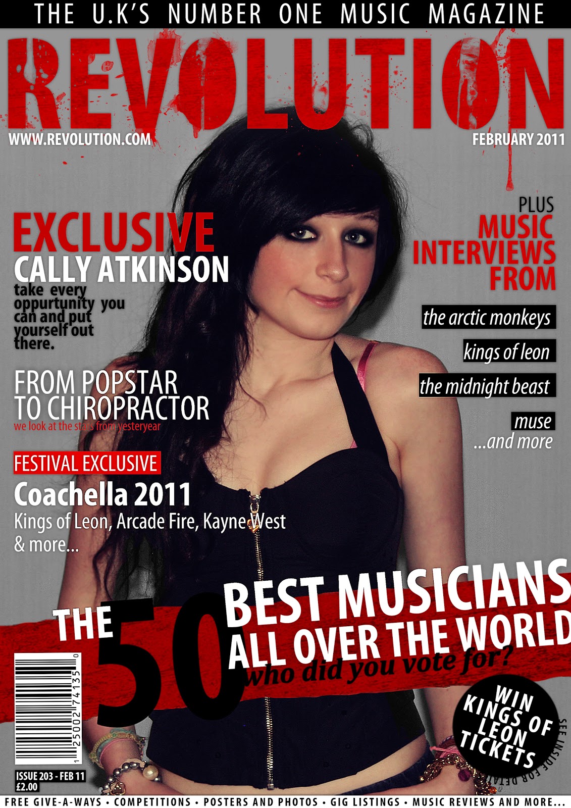
Here is the final design for my music magazine front cover page. After creating my first draft for my music magazine front cover page, I have ensured to gain as much feedback from both my lecturer and peers, which has allowed to reach this final stage of my production. In comparison to my first draft, I have made the following changes; I have sharpened the front cover image, to ensure it looks more professional much like the high quality photos used on most magazine front covers. I have also lowered the saturation of the main image, which will allow the image to be more consistent with the minimalistic colour scheme, whilst also allowing it to tie in with the grungy indie rock music theme by making it appear to be somewhat worn out. I changed the skyline, with a small sentence which simply states 'the u.k's number one music magazine'. This displays a dominance over other music magazines and ensures the reader that this magazine will be worth while purchase. As I still wanted to promote the freebies and gifts which were included in the magazine, as I felt this was important when attracting a younger audience, I placed the text which was on the skyline on the bottom of the page, which still allowed it to be visible. To promote freebies and gifts, I also added a competition promo to the front cover, to attract the younger audience. I also ensured to have a very high profile band included in the competition of the target indie rock genre, which not only attracts my target audience but those who may not purchase the magazine regularly but enjoy the band I have used.

Here is the final design for my music magazine contents page. After creating my first draft for my music magazine contents page, I have ensured to gain as much feedback from both my lecturer and peers, which has allowed to reach this final stage of my production. In comparison to my first draft, I have made the following changes; I have sharpened the image, to ensure it looks more professional much like the high quality photos used in most magazines. I have also lowered the saturation of the main image, which will allow the image to be more consistent with the minimalistic colour scheme, whilst also allowing it to tie in with the grungy indie rock music theme by making it appear to be somewhat worn out. I have increased the size of the page numbers within the contents page, to ensure they are larger then the other text making the pages numbers more recognisable for the reader, when they are for example looking to search for a chosen page. I changed the description of the main feature page, to give more of an insight into what the article may be about, which could spark more interest in the reader. I have also added a page number in the right hand bottom corner of the page, as it is a conventional aspect of a magazine and will also allow the reader to identify the page and to associate it with the numbers within the contents page.

Here is the final design for my music magazine double page interview spread. After creating my first draft for my music magazine double page interview spread, I have ensured to gain as much feedback from both my lecturer and peers, which has allowed to reach this final stage of my production. In comparison to my first draft, I have made the following changes; I have sharpened the images, to ensure they look more professional much like the high quality photos used in most magazines. I also added a feature promoting the CD of the featured interviewed artist, which displayed a picture of the CD case, which will allow readers to recognise the CD in-store if they wish to purchase it. I have also included the release date and where the CD can be purchased to ensure the readers can find and purchase the CD with ease. This will could perhaps also increase the sales of the magazine as those who who have purchased the CD, may be likely to remember they discovered it in this magazine. Lastly I have also added page numbers to the bottom outer corners of each page, as this is a conventional aspect of a magazine and will also allow the reader to identify the pages and to associate them with the numbers within the contents page.
No comments:
Post a Comment